AfterShip is proud to announce today a new version of our Android app.
Note: you can now vote AfterShip for Android on [Product Hunt](https://www.producthunt.com/posts/aftership-for-android/" target="_blank)
We've been testing it within the team and with some key users and the feedback so far has been great.
Since July 2014—initial launch—the design of the app has not changed. While we wanted to keep the same branding and feeling, we needed to refresh it.
More Material Design but also the need for a better user experience led us to imagine a better [AfterShip for Android](https://play.google.com/store/apps/details?id=com.aftership.AfterShip&hl=en/" target="_blank).
There are a couple of reasons why we went into that direction:
- update the outdated look
- update to support other new features (coming in 2017, stay tuned!!)
- enhance UI design with more emphasis on major users expectations: know when and where your shipment is
- address users top concerns: more notifications
As usual, we valued the feedback from our core users and tried to improve the app experience listening to their feedback. Here are the changes in detail.
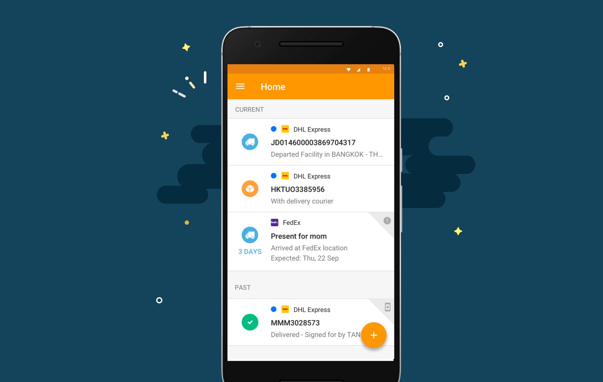
New Feature updates - Main View
By 'Main View', we mean the landing screen you see when you open the app.
- we merged ‘Current’ and ‘Past’ section
- we changed the detail view
- we've added ‘Expected date countdown’ to know when your shipment is arriving
- we've added the courier logo to help users get the information quicker
- we've added a blue indicator– so you know which shipments have updates
- you can now multiple delete/mark as delivered shipments
- you can swipe to delete/mark as delivered
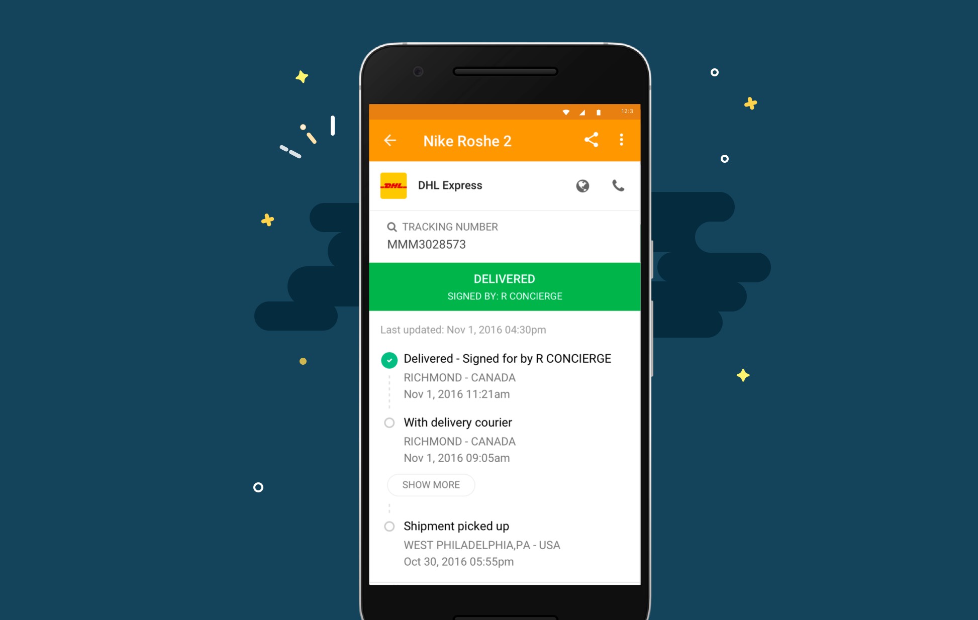
New Feature updates - Detail View
Detail view is when you click on your tracking number to see more information about it.
- we have removed the ‘more info’ page
- we've added a ‘Show more’ feature to display all the checkpoint status
Now what happens when you add shipment:
We grew the number of couriers from 150+ back in July 2014 to more than 370 now. You can still detect which courier it is—based on the format of your tracking number.
But we needed a better way for users to select the courier and to do so:
- we've enhanced the design to allow users to select the field they want to input first (the barcode scanner is now at the top)
- we've enhanced the courier list for a better user experience flow
- we've improved the copy to clipboard feature as we display more information.
What about the push notifications?
- we've changed the push notification default template
- we now enable users to customise the push notification settings
Design Perspective: how we approached the design revamp
The more we worked on the new design of our Android app, the more we realised about two challenges:
- how to display relevant shipping information in a condensed screen
- how to let our users know about the design changes
Add relevant shipping information into the Main View & Detail View
As you've noticed above, most of the design changes are happening on those two screens.
The challenge we had was finding out how we could display the most relevant information in such a condensed screen. The key concern from our users is to know when and where their shipment is.
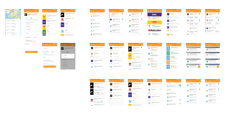
How could we design the main view and the detail view with that in mind? We went through a couple of drafts to reach this one.
Design challenges
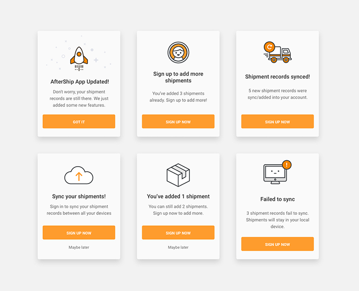
This challenge was all about how do we interact with the users within the app and let them know about the design changes. What would be the key messages to tell our users?
We've seen too many apps just list their new features as a simple text and we wanted to do something a bit different.
It's one thing to say: "Wohoo, we have a brand new update that includes this and that", but it's even better to let your users experience the changes by themselves.
By doing so, we are jumping in the right context to explain the design changes. You can see how it looks like whenever someone uses a new feature for the first time:
We also tried using illustrations instead of regular text or default prompt messages.
Don't forget to grab [AfterShip for Android](https://play.google.com/store/apps/details?id=com.aftership.AfterShip&hl=en/" target="_blank) and vote for us on ProductHunt!